All HCCI Reports
The First Year of the COVID-19 Pandemic Had a Disproportionate Impact on Inpatient Service Use in Socially Vulnerable Metro Areas

Each year, HCCI publishes an annual update to the Healthy Marketplace Index (HMI), an interactive tool that describes how health care prices, use, and spending vary across metropolitan areas. HMI helps us to understand how these aspects of the health care system compare and contrast to the median metropolitan area. We recently released the latest version of the HMI, which provides data from 2020, the first year of the COVID-19 pandemic, across 186 metro areas for approximately 41 million individuals enrolled in employer-sponsored insurance.
In this post, we go beyond the HMI report's standard assessment of health care spending, price, and use levels in 2020 to shed light on the impacts of COVID-19 across metro areas during the first year of the pandemic. We used HCCI's unique commercial claims data to examine how relative health care prices and use shifted within metro areas between 2019 and 2020. We also explored the social and community characteristics associated with changes in the health care landscape due to the pandemic.
Even with all of the changes in the health care system in 2020, it appears that metro areas generally did not experience comparative shifts in health care prices and use between 2019 and 2020. In other words, metros with high (or low) prices or use in 2019 continued to have high (or low) prices or use in 2020. There were unusual cases, however, where metro areas experienced a considerable change in use of health care services relative to the median. Those changes were driven by inpatient hospital use and were concentrated in more vulnerable communities.
Even with a major shock to the health care system, prices continued to rise
Within the 186 metro areas in the Healthy Marketplace Index (HMI), we found that health care prices grew in the median metro area, from $156 per-service in 2019 to $159 per-service in 2020. Further, prices across metro areas varied similarly in both years, ranging from 18% below the national median to over 90% above the national median (Figure 1, Panel A). Between 2018 and 2019, 164 out of the 186 metro areas (88%) experienced price growth. Between 2019 and 2020, the same number of metro areas showed a rise in prices. In both years, the average growth in the per-service price was 2%.
To better compare metro areas to one another, we rank ordered them from highest to lowest, separately in 2019 and 2020. A rank of 1 indicates a metro area with the highest prices, while a rank of 186 indicates the lowest prices. The scatterplot below shows the relationship between a metro area's ranking in 2019 compared to 2020 (Figure 1, Panel B). This figure suggests that the first year of the COVID-19 pandemic had almost no effect on a metro area's rank in median price per-service relative to its peers (i.e., metro areas with high (and low) prices, remained consistent between 2019 and 2020).
Figure 1. Changes in Median Price Per-Service in 186 Metro Areas in the Healthy Marketplace Index, 2019 versus 2020
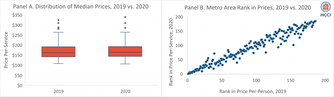
A rise in health care prices may be observed when hospitals/physicians provide a higher share of more intense, or expensive, services. In this context, the average price per-service would go up, creating the appearance of increased prices, even if there were no changes in negotiated reimbursement rates between insurers and hospitals/physicians. When we explored this possibility, we found that growth in prices could not be related to changes in the nature of the services provided, as 92% of metro areas provided less intense services in 2020 compared to 2019. Thus, the rise in prices between 2019 and 2020 reflected an increase in the actual negotiated payment rates.
Service use declined in 2020, for the first time in the Healthy Marketplace Index's history
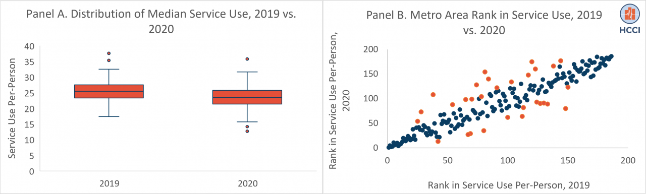
Unlike prices, which continued to rise through the first year of the COVID-19 pandemic, health care utilization patterns changed across metro areas. Health care use – measured by the average number of services used per-person – declined by 8% between 2019 and 2020, from 24.6 services per-person to 22.5 services per-person. In contrast, use of services increased by 1.4% between 2018 and 2019.
From 2018 to 2019, 139 out of the 186 metro areas (75%) experienced growth in service use. Between 2019 and 2020, only 7 out of the 186 metro areas (3.8%) showed a rise in service use. The use of services also varied to a greater extent in 2020 than in 2019, ranging from 44% below that national median to 58% above the national median (compared to 30% below to 53% above the median in 2019) (Figure 2, Panel A).
Similar to patterns observed in the rank ordering of prices in 2019 and 2020, relative changes in per-person use across metro areas were minor during the first year of the COVID-19 pandemic. As shown in Figure 2, Panel B, most metro areas showed consistency in their ranking in both years when compared to other metro areas. However, a small number of metro areas (displayed in orange), had more substantive changes in use compared to other metro areas.
Figure 2. Changes in Median Service Use Per-Person in 186 Metro Areas in the Healthy Marketplace Index, 2019 versus 2020
A few metro areas experienced larger changes in utilization, which were driven by inpatient service use
Generally, there were few changes in how metro areas compared to their peers during the first year of the pandemic. In other words, most high use metro areas in 2019 remained high use metro areas in 2020 (and vice versa). Nonetheless, there were still some metros with large changes in relative use, as 30 metro areas moved at least 25 places in their rank order for service use. Among these metro areas, 57% experienced a decrease in use, while 43% experienced an increase in use.
In both cases, considerable change in use within metro areas was associated with a shift in the use of inpatient services. From 2019 to 2020, all metro areas that lowered their rank by at least 25 places in overall use experienced a drop in the use of inpatient services, with a 12% average decline. During the same time period, 77% of all metro areas that raised their rank by at least 25 places in overall use increased the use of inpatient services, with an average growth rate of 5%. As shown in Figure 3, as a metro area's rank increased between 2019 and 2020, its growth in inpatient service use increased.
Figure 3. Percent Change in Inpatient Service Use among Metro Areas with Large Change in Rank of Overall Use, 2019 to 2020
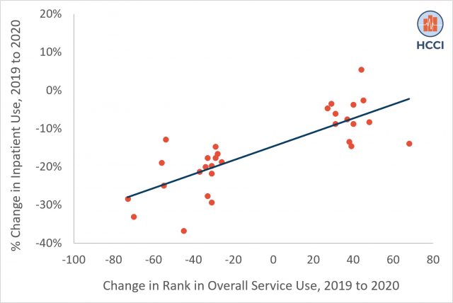
Although we did not assess the types of services driving these changes, we anticipate that these shifts are consistent with findings from HCCI's latest Health Care Cost and Utilization Report. In this report, we saw that reductions in inpatient use in 2020 were primarily due to a decline in elective services (e.g., musculoskeletal hospital admissions), while increases in inpatient service use were largely attributable to services that were associated with the pandemic (e.g., respiratory hospital admissions).
Increases in inpatient utilization were concentrated among socially vulnerable communities
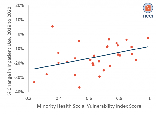
Between 2019 and 2020, our data show that changes in inpatient use were associated with the vulnerability of a community, as measured by the Minority Health Social Vulnerability Index (MH-SVI). Research from the first year of the pandemic highlights the disproportionate impact of COVID-19 on socially vulnerable communities, prompting inequities related to the incidence of the disease and deaths per capita. Social vulnerability is shaped through a multitude of factors, including structural inequities (e.g., poverty, poor housing conditions, and inadequate transportation) that predispose lower-resourced communities to be less resilient in their ability to respond and recover from emergency events such as the COVID-19 disease outbreak, compared to higher-resourced communities.
The MH-SVI is a composite score that identifies areas that need support before, during, and after public health emergencies, such as the COVID-19 pandemic, across several dimensions of health care access, medical vulnerability, minority health, socioeconomic status, and housing and transportation quality. Scores range from 0 to 1, with a higher score representing greater social vulnerability.
Metro areas that experienced a decline in inpatient use had an average MH-SVI score of 0.56, relative to metros with a rise in inpatient use, which had a mean MH-SVI score of 0.74. More broadly, as a community became 10% more vulnerable, their use of inpatient services increased by an average of 23%, shown in Figure 4 below. For example, El Paso, TX, one of the most socially vulnerable metro areas (with a MH-SVI score of 0.99) went from inpatient service use that was 2% below the national median in 2019 to 6% above the national median in 2020.
Figure 4. Percent Change in Inpatient Service Use by Minority Health Social Vulnerability Index Score, 2019 to 2020
Most effects of COVID-19 in 2020 on the health care system occurred proportionately across metro areas, with some exceptions
In 2020, the COVID-19 global health crisis placed an unprecedented strain on the health care system. Accelerated rates of infections and deaths led to hospital overcrowding, prompting a shortage of health care workers and hospital beds. These pressures, alongside a temporary pause on elective procedures and higher rates of delayed or foregone preventive care, were expected to disrupt health care spending patterns.
We recently released our Healthy Marketplace Index (HMI), which helps to compare health care spending, prices, and use across 186 metropolitan areas. Consistent with prior HCCI research, we found that health care spending declined in metro areas for the first time in recent years. We found that the decline in spending was driven by a drop in health care use per-person, as prices per-service continued to rise.
In this report, we supplemented our annual release of HMI by exploring how health care prices and use in metro areas changed between 2019 and 2020. We found that, among metro areas, relative prices and use were similar in 2019 and 2020. This finding suggests that while each metro area had a unique experience at the head of the COVID-19 pandemic, with different hardships for its health care workers, a variable impact on its population health and safety, and a wide array of policies targeting the virus, patterns within the health care system moved proportionately across communities.
As we explored these relative changes further, we found a small number of metro areas experienced disproportionate changes in service use. We observed these changes in the locations and services that were most acutely affected by the pandemic: socially vulnerable communities (defined using the MH-SVI) that saw a rise in inpatient admissions. This points to deepening disparities in access to health and safety among low-income and medically vulnerable populations, and communities of color.
The fact that metro areas with large increases in inpatient service use were often socially vulnerable highlights a need to focus on racial, socioeconomic, and housing disparities as they relate to medical vulnerability and health care infrastructure. It is clear that resources are needed to improve preparedness within communities experiencing structural inequities, to ensure they are adequately armed to weather the current and future health care crises.
Stay Informed
When you subscribe to the blog, we will send you an e-mail when there are new updates on the site so you wouldn't miss them.
©
2024
Health Care Cost Institute Inc. Unless explicitly noted, the content on this website is licensed under a Creative Commons Attribution Non-Commercial No Derivatives 4.0 License
