
Recently, the Health Care Cost Institute (HCCI) published its Healthy Marketplace Index (HMI) – Price Index report, examining relative health care prices in 112 different metropolitan areas. This report is the first in a new series of releases from the HMI project, funded by the Robert Wood Johnson Foundation, which compares commercial health care markets across the country.
We found widespread variation in prices across metro areas [i]. For example, patients in San Jose, California faced health care prices up to 2.5 times higher than patients in Baltimore, Maryland. Interestingly, though, we also found a heavily skewed distribution. Of the 112 metro areas studied, 86 had price levels below the national average. This raises the question: are high health care prices only problematic for a small portion of the country?
Not necessarily. Comparing a metro to the national average simply tells you how high (or how low) that metro areas prices were on the distribution of prices at that time. It could be the case that all prices across all metro areas were high (or low). Diving further into our data, we found that, regardless of their relationship to the national average, health care prices were dramatically more expensive in 2016 than in they were in 2012 almost everywhere [ii].
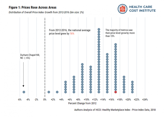
From 2012 to 2016, the national average price level grew 16% (Figure 1)[iii]. By comparison, there was 4.5% inflation over the same period [iv]. Strikingly, only one metro (Durham-Chapel Hill, North Carolina) experienced a decrease in their average price level across the study’s time frame. The majority of metros saw their price levels grow by more than 13%, with the highest being New York City and Tampa, Florida – both of which experienced 22% growth in their average price level.
Price growth wasn’t limited to a particular category of services. We broke out overall prices into three medical service categories – inpatient admissions, outpatient facilities, and professional procedures[v]. All but three metro areas experienced price growth across each service category (Figure 2).
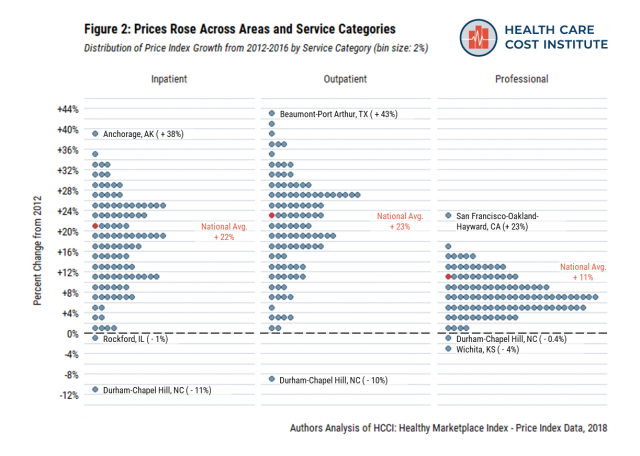
Outpatient visit prices had the highest national average growth rate over the study period (23%). In many cases, a metro area had below average prices in 2016, even though those prices had grown dramatically since 2012. For example, in 2016, Tucson, Arizona had outpatient prices 25% below the national average. But, Tucson’s outpatient also prices grew 41% over the 5-year study period – the second fastest growth rate in the country.
Nationally, inpatient prices also grew rapidly from 2012 to 2016 (22%). As with outpatient prices, there were many cases where a metro had below average price levels in 2016 despite experiencing price growth over the previous five years. Little Rock, Arkansas had inpatient prices 41% below the national average in 2016, but also a 28% increase in their prices relative to 2012.
Compared to the other categories, professional procedures prices grew at a lower rate. Still, the national average grew 11% over the study period. While 83 of the 112 metros had price increases of less than 10%, some areas had particularly high professional price growth (e.g., San Francisco, 23% growth).
Comparing price levels within a given year provides a useful benchmark, helping us understand how high (or low) prices are relative to one another. However, to an individual living in a particular area, the perhaps more important trend is that the same health care services became more expensive in recent years. While we found many distinct trends across and within metro areas, nearly all had the same shared experience – rising health care prices.
End Notes
[i] We defined metro areas as Core Based Statistical Areas (CBSAs), as identified by the Office of Management and Budget, to define our metro areas.
[ii] For more information about the Healthy Marketplace Index project, the data we used, and our methods please see our website.
[iii] Price levels compare the prices of metro areas to the national average within one year, in this case 2016. Growth rates compare the price level of the same CBSA over time; most often we report the growth rate between the first and last year of our study (2012 and 2016).
[iv] We calculated inflation using the annual average CPI-U from 2012 (229.594) to July 2016 (240.007). Available online.
[v] Inpatient services are rendered to patients who are kept in a health care facility overnight for treatment but not for observation. Outpatient services are rendered to patients by sections of a hospital that provide medical services not requiring an overnight stay or hospitalization (e.g., emergency room [ER], outpatient surgery, observation room). Professional services are rendered to patients by a health care professional. Service claims with no valid revenue code are assumed to be professional services (e.g., office and preventative visits, administered drugs).