It is well documented that Americans spend a lot on health care, but this issue is often discussed in terms of share of GDP, billions of dollars, or an astoundingly high hospital bill. These numbers can be hard to relate to; it’s hard to imagine billions of dollars, let alone a share of the national economy. A pricey bill may get our attention, but can seem like a special case that doesn’t relate to our own health care spending experience. Many people may not know how much they will end up spending on health care in an upcoming year, let alone how their spending compares to others’. To address some of these questions, HCCI developed a tool to show how common a given amount of annual health care spending is, for people under 65 with commercial health insurance.
We found that most people spend over $1,000 a year, and while health care spending above $20,000 in a year is rare, it was experienced by 10% of people in a three-year period. Our findings highlight the unpredictable nature of health care spending and build on the recent HCCI issue brief and accompanying NEJM Catalyst piece, which documented the substantial turnover among the group of top health care spenders. Within a single year, a majority of spending is incurred by a small number of people, but the individuals that make up this group change substantially over time.
We invite you to use our interactive graph tool to explore how common different levels of health care spending are by age group and gender. While the numbers in this graph tool are not meant to be interpreted as specific predictions, we hope they provide relatable examples of how individuals experienced substantial health care spending over various time periods.
How to use and interpret the chart:
- Select a spending threshold
- Select Gender
- Select Age
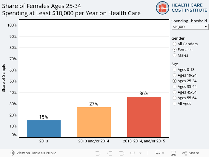
The first bar shows the percent of people who spent at least the threshold amount on health care in 2013. The second bar shows the percent who spent at least the threshold amount in 2013 and/or 2014. The third bar shows the percent who spent at least the threshold amount in 2013, 2014 and/or 2015.
Methods Note
Using the HCCI claims data, we compiled a panel of individuals with continuous enrollment in the same commercial insurance plan from 2013-2015. We restricted our analysis to plans in the small or large group insurance markets. We further limited our sample to people with three full years of prescription drug coverage. We aggregated all health care spending by individuals within each calendar year. All numbers here refer to the total health care spending by an individual – the sum of payer spending and an individual’s out-of-pocket spending. We define an individual’s age as it was in 2013. All dollar values are nominal.