In the first brief of the Past the Healthy Marketplace Index series, we explored how prices compared across the country and found that, in 2017, health care prices for specific services varied by as much as 22-fold across metro areas and even up 40-fold within them. In this next brief, we looked at variation in price growth and examined if that variation was related to the substantial observed differences in price. Understanding if high prices are due to rapid price increases or different underlying factors can help determine areas of focus when crafting policies aimed at slowing health care spending growth.
In order to explore these differences in price growth, we analyzed the changes in negotiated rates – the actual prices paid – for six commonly-used services among individuals with employer-sponsored insurance (ESI) in more than 100 metros across the U.S. We found that, while prices grew in nearly every metro for every service, there was striking variation in price growth across geographies. Additionally, we found that high prices in 2017 were not always due to large price increases over time. Some regional prices have, instead, been consistently high throughout the study period potentially due to historically high costs of living or a provider market that has persistently been highly concentrated, among others.
Prices grew in more than 60% of metro areas for each of the six services we studied. We not only saw substantial increases in median prices of our sample services within metro areas, but wide variation in price changes across services as well. For example:
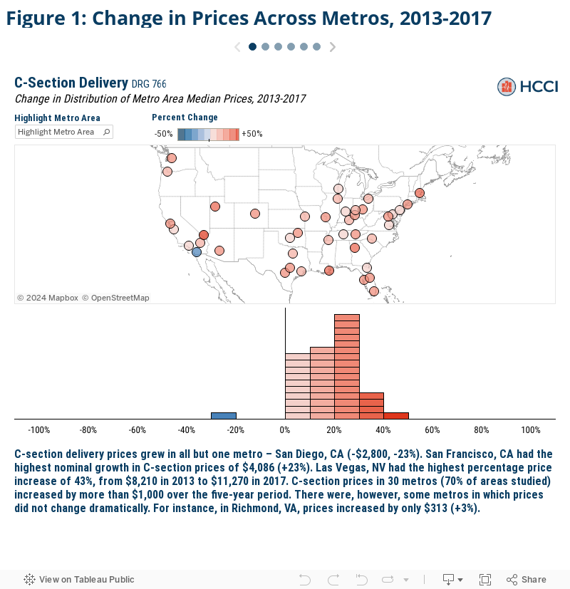
- C-section prices in some metros, like San Francisco, CA, had median price increases of $4,086 (+23%), while prices in others, like Richmond, VA, increased by just $313 (+3%).
- Median mammogram prices in Trenton, NJ, rose by $360 (+141%) over the 5-year period, but prices fell by $114 (-66%) in North Port, FL.
- Established patient office visit prices grew by more than 75% (+$71) in San Jose, CA, but fell by almost 10% (-$8) in Wichita, KS.
Despite the consistent and widespread growth in service prices over time, high prices in 2017 were not always the result of substantial price increases from 2013 to 2017 (or vice versa):
- San Diego, CA had the smallest growth in vaginal delivery median prices (less than +1%), however, the metro still had the 10th highest price studied in 2017 ($9,075).
- The price of a screening mammogram increased by less than 1% in Bridgeport, CT over the 5-year period, but had the third most expensive 2017 prices ($398).
- For some services though, like new patient office visits, large price increases tended to result in high prices such as in Green Bay, WI where both 2013 to 2017 price growth (+18%) and 2017 prices ($210) were among the top 10, respectively.
How we compared service prices across metro areas
As discussed in the first Past the Healthy Marketplace Index brief, the overall HMI project examined health care prices in 124 Core Based Statistical Areas (CBSAs), or metro areas, across the country for the years 2013 to 2017. However, those indices, by construction, mask much of the nuance within those service categories. For example, an area may have experienced relatively low growth in average inpatient prices but relatively high price growth for a given inpatient service like a knee replacement (and vice versa). As such, more insights can be gleaned from exploring prices and price changes at the service level.
In this brief, to demonstrate the extent of variation in price growth across metro areas, we examined prices in the first (2013) and final year (2017) of the study for our six Past the Healthy Marketplace Index services. We measured prices for each service as the total allowed amount associated with each claim – that is, the sum of the actual insurer and patient out-of-pocket expenditures. We then explored the changes in prices over time for each metro and service.
For detail on the membership, utilization, and geographic health care provider density thresholds required, see the Data and Methods section.
Within metro areas, some service prices increased by as much as 160% in just 5 years
We first compared each metro area’s change in median prices for each selected service to the corresponding service price change in every other metro. We found substantial variation in price changes for the same services across metros, even in metros that were relatively close in geographic proximity.
Click the arrows in the figure below to view each selected service.
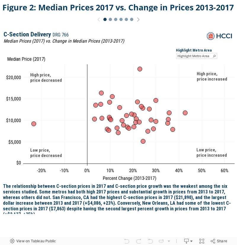
High price levels in 2017 were not always due to rapid price growth across metro areas, and vice versa
In this brief, we found that prices increased nearly everywhere for every service between 2013 and 2017, but there was wide variation in the magnitude of that price growth. In the first Past the Healthy Marketplace Index brief, wide variation was found in prices across metro areas in 2017 as well. To understand whether metros with high (or low) prices in 2017 typically had high (or low) price growth over the study period, we compared the two measures within metros and services (Figure 2).
While areas with high prices in 2017 tended to experience higher price growth, there was not a strong relationship between the two, with many metros experiencing opposing trends. Las Vegas, NV had some of the most expensive blood test prices in 2017 ($354) and some of the highest growth in prices from 2013 to 2017 (152%). Houston, TX, however, had similar blood test prices in 2017 ($311), but experienced a price decline (-3%) over the study period.
Conclusion
We found that prices for our selected, commonly used health care services not only typically rose between 2013 and 2017, but oftentimes rose at strikingly high rates. For example, vaginal delivery prices increased 59% in Boston, MA and a screening mammogram in Pensacola, FL increased 152% over just a five-year period. Further, we found the magnitude of the changes in price varied dramatically across and within metro areas, too. In San Jose, for instance, new patient office visit prices increased 76% while C-section delivery prices increased just 6%.
When this variation was compared to the variation in 2017 prices, though, we did not find strong relationships between the two. This suggests that high prices were not always caused by high price growth, but oftentimes were consistently high due to other previously existing underlying factors – such as a persistently concentrated provider market or historically high costs of living.
As prices have been shown to be a key driver of health care spending, identifying where and the rate at which prices are increasing are valuable pieces of information for health care stakeholders. In order to address those areas of substantial price growth, policymakers must also attempt to discern why that growth is occurring. Our findings demonstrate that high prices were due to rising prices in some areas but were consistently high and unrelated to recent price growth in other areas.
Therefore, a single, nationwide policy addressing price growth may have different effects on health care spending across and within regions. For instance, tying rates to Medicare might be more impactful in an area where prices have increased rapidly of late. Whereas, exploring policies aimed at other underlying regional specific factors may be more impactful in an area that generally had high prices over the entire study period. The sizable variation in price growth shows that solutions to slow rising prices should be crafted on a case by case basis, as one size fits all policies will have dramatically different effects across services and geographies.
Check out the other brief in this series
Exploring Actual Prices Paid for Specific Services by Metro Area
More about HMI
HCCI tracks drivers of health care spending across 124 U.S. metro areas through the Healthy Marketplace Index (HMI) project. The HMI report presents an interactive exploration of a series of metrics – price, utilization, and hospital market concentration – that help stakeholders evaluate local health care market performance across the country. The HMI also allows for metro-specific interrogations about how local spending is determined by these spending drivers, as well as how they’ve changed over time.
Understanding the nuances of local health care spending informs which policy levers may be most effective to address rising costs. Granular and widespread data are necessary resources when crafting such targeted and efficient policies. As such, all of the data used throughout the HMI are freely available for public download alongside detailed methodology documentation and frequently asked questions.
For more information, contact us via data@healthcostinstitute.org or follow us at @HealthCostInst on Twitter.
Data and Methods
The service claim level analytic data set used for this analysis is a subset of that used for the Healthy Marketplace Index (HMI) reports. For a complete explanation of how the HMI data set was constructed from the entire Health Care Cost Institute (HCCI) commercial claims database – see the HMI methodology document. From this service claim level data set, we pulled all the claims associated with two selected services from each of the three categories of services for a total of 6 services. The selected services were identified by their service codes; DRG for inpatient admissions and the combination of CPT code and CPT code modifier (referred to as “CPT code” hereafter, however all CPT code modifiers were blank) for outpatient and professional services. The services and corresponding service category and identifying service code are as follows: C-section delivery (inpatient, DRG 766), vaginal delivery (inpatient, DRG 775), comprehensive metabolic panel (outpatient, CPT 80053), bilateral screening mammography with computer-aided detection (outpatient, CPT G0202), established patient, mid-level office visit (professional services, CPT 99213), and new patient, mid-level office visit (professional services, CPT 99203). These services were selected due to their high prevalence in the HCCI data.
The price for each service claim was the sum of the allowed amounts (the actual amount paid to the providers including any insurer payments and patient cost sharing) associated with that service claim’s individual, common dates, and service code. For inpatient admissions, the price reported does not necessarily encapsulate the entire cost of a typical admission for a given service code as there may exist other ancillary services (such as anesthesia or other professional services) that are not billed under the same DRG code. Additionally, while the specificity of CPT codes prevents the prices reported from excluding additional costs for that service, additional services provided to the individual on the same day would not be included in this analysis’ price measures. The reported nominal (dollar) change in price was the difference between the 2017 and 2013 median prices for a given metro area and service combination. The reported relative change in price was the percent change in 2017 and 2013 median prices for a given metro area and service combination.
Our final CBSA analysis sample was selected from the broader, 124 CBSA sample used in the HMI reports. We only report price measures for CBSAs with both sufficient data coverage and service prevalence for each service we report. We then limited our sample CBSAs to only those which met the relevant thresholds for both selected services within each service category. Our final analysis examined inpatient prices in 43 CBSAs, outpatient prices in 82 CBSAs, and professional service prices in 120 CBSAs.