
How much people spend on health care from place to place reflects multiple, interwoven, and dynamic factors, such as the cost and use of services. Health care spending and its driving factors change over time, differ across geographies, and vary by type of service. The Health Care Cost Institute’s (HCCI) Healthy Marketplace Index (HMI) provides a number of metrics illustrating how health care spending among those with employer-sponsored insurance (ESI) is related to these different factors at the local level.
The HMI reports measures like spending, price, and use for broad service categories (Inpatient, Outpatient, and Professional). However, specific services within these categories do not always act in the same manner. In this series of reports, Past the Healthy Marketplace Index, we examined one of these measures – health care prices – for a set of six select services (two from each broad service category) to demonstrate this nuance. These service-level measures illustrate how prices varied substantially and how that variation reflects differences in underlying factors.Collectively, they demonstrate how stakeholders can use data resources like the HMI when crafting case by case policies to tackle commercial prices in their region as one-size-fits all solutions will have dramatically differing – and potentially negative – affects across and within localities.
In a previous HMI report, we showed how aggregated price indices varied dramatically across geographies within a service category. For example, average inpatient prices in San Francisco, CA were 3 times greater than those in Little Rock, AR. Similarly, average outpatient prices in San Jose, CA were more than 3 times greater than those in Baltimore, MD, while professional prices were over 2 times greater in Anchorage, AK than Youngstown, OH.
In this first section of the Past the Healthy Marketplace Index, we examined the actual prices paid for a set of common services across over 100 metros and found even more striking variation.
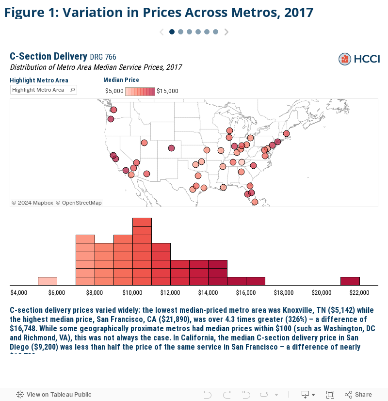
- The median price for C-sections in San Francisco ($21,890) was nearly 4.3 times that in Knoxville, TN ($5,142);
- A common blood test, though, in Corpus Christi, TX cost $434, nearly 22 times more than the same test in Kalamazoo, MI ($20); and
- Established patient office visits specifically had median prices almost 3 times larger in Anchorage ($169) than in Miami, FL ($60).
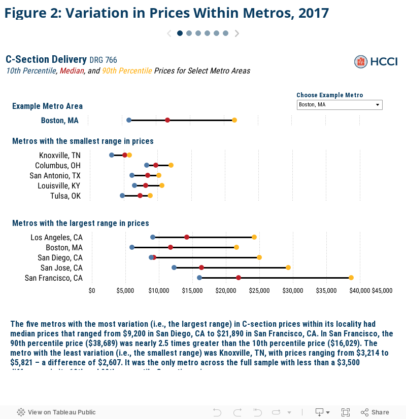
Service prices also varied widely within metro areas. We found up to a 40-fold price difference for the exact same service (blood tests in Tampa, FL) even after removing the top and bottom 10% of prices to exclude outlier effects.
- The median price of a vaginal delivery in Los Angeles, CA was $10,243 but ranged from $6,110 at the 10th percentile to $17,126 at the 90th percentile, a difference of $11,016, or 108 percent of the median price;
- The price of a screening mammogram varied by 5-fold in Trenton, NJ,where the median price was $616. The 90th percentile price was $1,593 while the 10th percentile price was just $316; and
- The price of a new patient office visit varied by 3-fold in Milwaukee, WI, where the median price was $192. The 90th percentile price was $338 while the 10th percentile price was $104.
How we compared service prices across metro areas
One of the key metrics explored within the HMI is health care prices, as prices have been shown in previous studies to be a leading driver of spending. We measured prices for each service as the total allowed amount associated with each claim – that is, the sum of the actual insurer and patient out-of-pocket expenditures. The most recent iteration in the HMI examined overall health care prices in 124 Core Based Statistical Areas (CBSAs), or metro areas, across the country.
We created an overall and service category specific price index for inpatient admissions, outpatient visits, and professional services. Each index comprised a basket set of common services held constant throughout the study and displays the average prices paid in a given area for a given category of service. The price indices revealed substantial variation in overall and category-specific prices, but by construction, mask much of the nuance within those service categories. And while typically correlated, as other studies have found, there can be variation within service category prices within certain areas. For example, an area may have relatively high average inpatient prices but relatively low prices for a given inpatient service such as a knee replacement (and vice versa).
To demonstrate the extent of price variation, we examined prices for two selected commonly-used services from each of the three service categories for a subset of the HMI sample metro areas. We measured prices for each service as the total allowed amount associated with each claim – that is, the sum of the actual insurer and patient out-of-pocket expenditures – and calculated the 10th percentile, median, and 90th percentile prices in each metro area.
We studied the following services:
- Two types of childbirth admissions—the most common inpatient admissions in the HCCI dataset in 2017: C-section delivery and vaginal delivery.
- Two types of frequently performed lab tests: a common blood test (comprehensive metabolic panel) and a screening mammogram (bilateral screening mammography with computer-aided detection).
- Two types of office visits that accounted for 9% of all professional services in 2017: established mid-level expanded problem office visit and new patient mid-level expanded problem office visit.
For more detail on the membership, utilization, and geographic health care provider density thresholds required, see the Data and Methods section.
Across metro areas, median prices for the same service varied by up to 22-fold
We first compared each metro area’s median selected services prices to the corresponding prices in every other metro. We found substantial variation in prices for the same services across metros, even in metros that were relatively close in geographic proximity. Further, we found that high local prices for one service did not necessarily mean that prices were high for all services within the given metro.
Click the arrows in the figure below to view each selected service.
The same service could cost up to 40 times more, even within the same metro area
We found wide variation not only for service prices across metro areas, but within metros as well. Some difference in prices between metros is to be expected because of differences in the cost of living and other input costs. However, the magnitude of price variation for the same service within localities was all the more striking. We found that, even after excluding the top and bottom 10% of prices to moderate any outlier effects, the prices for the same service in the same metro varied by as much as 40-fold in relative terms (blood tests in Tampa, FL) or by $22,660 in real dollar terms (C-section deliveries in San Francisco, CA).
To explore these within metro area differences, we chose ten metros for each selected service– the five metros with the smallest price variation and the five metros with the largest price variation. We plotted the 10th, median, and 90th percentile prices within each metro side by side. This gives us a clearer picture of the range of prices that were paid in a given metro. A larger range indicates more variance in price and vice versa.
Further, the service specific median prices and the 10th and 90th percentile ranges in price for all the metros in our analysis are searchable in the Figure 2 and available as a separate data download, as well.
Conclusion
We found that prices for clinically equivalent services varied substantially across markets, and, for some services, vary even more across providers within the same market. With prices differing so considerably, health care stakeholders must first understand what local prices are in order to know where to focus efforts addressing the high and growing costs straining family, business, and government budgets. For instance, using resources like the HMI, policymakers and employers alike may want to explore why the median price for a C-section is San Francisco, CA is 238% that in San Diego CA, or how one screening mammogram can cost 5 times another in Trenton, NJ.
The inter- and intra-geographic differences in prices paid for the same services supports the need for nuanced and specific policymaking to lower health care costs. For example, policies such as benchmarking commercial rates to Medicare rates or wide-spread efforts improving price transparency to reduce price variation may have differential impacts across metros or even within metros as well. Identifying these different effects ahead of time can help policymakers craft targeted, case-by-case solutions and project potential outcomes.
Check out the other brief in this series
Exploring Changes in Actual Prices Paid for Specific Services by Metro Area from 2013 to 2017
More about HMI
HCCI tracks drivers of health care spending across 124 U.S. metro areas through the Healthy Marketplace Index (HMI) project. The HMI report presents an interactive exploration of a series of metrics – price, utilization, and hospital market concentration – that help stakeholders evaluate local health care market performance across the country. The HMI also allows for metro-specific interrogations about how local spending is determined by these spending drivers, as well as how they’ve changed over time.
Understanding the nuances of local health care spending informs which policy levers may be most effective to address rising costs. Granular and widespread data are necessary resources when crafting such targeted and efficient policies. As such, all of the data used throughout the HMI are freely available for public download alongside detailed methodology documentation and frequently asked questions.
For more information, contact us via data@healthcostinstitute.org or follow us at @HealthCostInst on Twitter.
Data and Methods
The service claim level analytic data set used for this analysis is a subset of that used for the Healthy Marketplace Index (HMI) reports. For a complete explanation of how the HMI data set was constructed from the entire Health Care Cost Institute (HCCI) commercial claims database – see the HMI methodology document. From this service claim level data set, we pulled all the claims associated with two selected services from each of the three categories of services for a total of 6 services. The selected services were identified by their service codes; DRG for inpatient admissions and the combination of CPT code and CPT code modifier (referred to as “CPT code” hereafter, however all CPT code modifiers were blank) for outpatient and professional services. The services and corresponding service category and identifying service code are as follows: C-section delivery (inpatient, DRG 766), vaginal delivery (inpatient, DRG 775), comprehensive metabolic panel (outpatient, CPT 80053), bilateral screening mammography with computer-aided detection (outpatient, CPT G0202), established patient, mid-level office visit (professional services, CPT 99213), and new patient, mid-level office visit (professional services, CPT 99203). These services were selected due to their high prevalence in the HCCI data.
The price for each service claim was the sum of the allowed amounts (the actual amount paid to the providers including any insurer payments and patient cost sharing) associated with that service claim’s individual, common dates, and service code. For inpatient admissions, the price reported does not necessarily encapsulate the entire cost of a typical admission for a given service code as there may exist other ancillary services (such as anesthesia or other professional services) that are not billed under the same DRG code. Outlier prices were trimmed by excluding the lowest 1% of allowed amounts. The claims with the highest 1% of allowed amounts were top coded where we assigned the 99th percentile allowed amount within each year to each of these claims. Additionally, while the specificity of CPT codes prevents the prices reported from excluding additional costs for that service, additional services provided to the individual on the same day would not be included in this analysis’ price measures. The 10th percentile, median, and 90th percentile prices reported are calculated as the relevant percentile of the prices paid for a service within the relevant CBSA in the relevant year, regardless of provider.
Our final CBSA analysis sample was selected from the broader, 124 CBSA sample used in the HMI reports. We only report price measures for CBSAs with both sufficient data coverage and service prevalence for each service we report. We then limited our sample CBSAs to only those which met the relevant thresholds for both selected services within each service category. Our final analysis examined inpatient prices in 43 CBSAs, outpatient prices in 82 CBSAs, and professional service prices in 120 CBSAs.