
People in the United States routinely cite health care and health care costs as top concerns.1,2,3,4 For the more than 160 million people who get insurance from their employer, the cost of health care is high, growing, and outpacing growth in wages.5,6,7 Across the country, health care costs show up in the form of higher premiums and higher out-of-pocket costs (for services that are both in-network and out-of-network). The Health Care Cost Institute’s (HCCI) Health Care Cost and Utilization Report found that, from 2014 to 2018, prices accounted for about 75 percent of the increase in spending above inflation.8 Accordingly, without addressing high and growing prices, efforts to make health care more affordable will be incomplete at best and fruitless at worst.
For many years policymakers have considered proposals to address the affordability of health care, some of which in recent years have sought to benchmark payments for the commercially insured to Medicare rates. For example, state and federal lawmakers have proposed capping what people have to pay out-of-pocket for seeing a clinician or provider out of their insurance company’s network.9 Multiple states (e.g., North Carolina, Montana, Oregon) have enacted or are pursuing policies tying reimbursement rates for state employee health plans to Medicare.10 In some proposals, these caps could be determined as a percent of Medicare rates for similar services. Some legislators and presidential candidates have supported expanding access to insurance through introducing a public option (that could use Medicare rates, or rates derived from Medicare rates as a basis of payment) or creating a new public program (such as Medicare for All). Comparing prices paid in employer-sponsored insurance (ESI) to Medicare can help illustrate possible impacts of policies tying commercial prices more closely to Medicare rates. Such a comparison also can illustrate the effects of such policies by location, type of provider, and specialty as well as the likely resulting stakeholder reactions to those effects.
We use data from HCCI to compare the negotiated rates paid by commercial payers for professional (clinician) services to the Medicare payments for the same services in different areas of the country. Professional services represent the most common category of health care services performed among the commercially insured, and account for almost 34% of commercial health care spending annually.11 Using a sample of nearly 210 million claims for ESI individuals in 2017, we measure the average commercial prices paid for the 500 most commonly provided services in professional settings across 271 metro areas and across 48 states and Washington, DC. We subsequently compare, on average, the prices paid for professional services with what Medicare would have paid for the same services per the Physician Fee Schedule (Medicare rates).
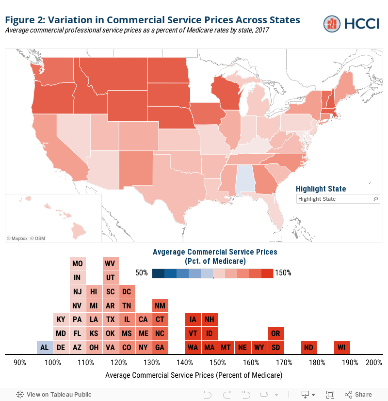
We find that commercial prices for professional services were, on average, 122% of Medicare rates nationally in 2017. Average commercial prices varied dramatically across states, from below Medicare rates in Alabama (98% of Medicare) to nearly twice Medicare rates in Wisconsin (188% of Medicare). We find that the difference between commercial and Medicare prices was largest in northwestern states.
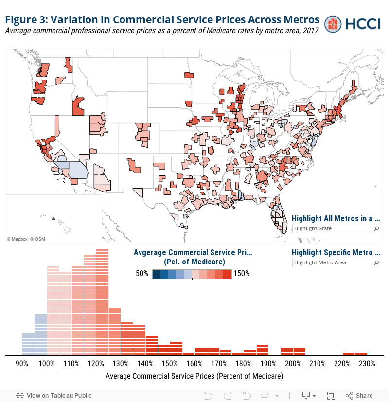
We also find significant variation in how commercial prices compared to Medicare at the sub state level For example, within California, commercial prices averaged 95% of Medicare in Bakersfield but 178% of Medicare in Santa Cruz. In other states, commercial prices were similar across metro areas – for example all Louisiana metro areas had average prices between 107% and 120% of Medicare rates. We further documented variation in commercial prices within metro areas between primary care and other types of providers, and across different services.
Our findings build on previous work, described below, that publicly reports how commercial professional service prices compare to Medicare rates at a local level. The variation we find both across and within localities suggests that any policies that rely on benchmarking commercial prices to Medicare rates may have a dramatically different impact across depending on the area. For example, a policy capping commercial rates for out-of-network providers at 150% of Medicare would lower rates paid to providers in Bakersfield on average while increasing rates paid to providers in Santa Cruz, CA.
Using HCCI Data to Compare Commercial and Medicare Prices
It is well documented that the prices paid by commercial insurers are, on average, higher than the prices paid by Medicare for the same services.12 This, in part, reflects the fact that Medicare prices are set administratively while the prices paid by commercial insurers are the result of negotiations between insurers and providers. Previous work has provided evidence that negotiation affects commercial prices. For example, research has shown that average commercial professional service prices tend to be higher in areas with less competitive physician markets.13
We compare the prices paid by commercial insurers for the same professional (clinician) services to what Medicare would have paid for the same services on average. Using our sample of professional services, we identify the average allowed amount paid across all claims for a set of common services in each geographic area (metro area, state).14 The allowed amounts reflect the sum of all insurer and individual out-of-pocket payments. We then map the amount Medicare would have hypothetically paid for the same service based on the location of the provider using the Medicare Physician Fee Schedule (PFS).15
For example, consider an established patient office visit received in Atlanta, GA (specifically, CPT Code: 99213). We observe that the average price paid by commercial insurers in 2017 was $93. By comparison, according to the PFS, Medicare would have paid $74 (non-facility rate). By taking the ratio of the average price paid by commercial insurers and what Medicare would have paid, we see that for an established patient office visit commercial insurers paid an average of 126% of Medicare rates.16
We repeat this process – compute the ratio of average commercial to Medicare price ratios – for a set of the 500 most common professional services in each metro area and in each state (across metro areas). We then take a weighted average across services according to their frequency nationally to summarize the average ratio of commercial to Medicare prices in each geographic area (metro area, state). This allows us to have a standardized comparison of the average commercial and Medicare prices across different geographic areas. Using this approach, we find that on average commercial insurers paid 132% of Medicare prices across all 500 professional services in our basket in Atlanta in 2017.
Nationally, Commercial Professional Service Prices Averaged 122% of Medicare in 2017
Nationally, we found that the commercial prices paid for the average professional service were 122% of what would have been paid under the Medicare Physician-Fee-Schedule (PFS). Figure 1 compares our findings to those from previous studies measuring commercial service prices relative to Medicare rates by broad category of service (Inpatient, Outpatient, Professional) summarized in a recent Kaiser Family Foundation literature review.17
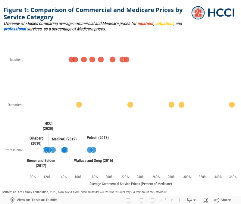
The national average observed in our sample is similar to previous estimates from the most comparable studies – namely those using data from large national insurers and focused on office visits.18,19 While our sample is not limited to office visits, we measure a weighted average of price ratios across a sample of common services in which office visits tend to be heavily weighted (as they are among the most frequently used services). As office visits tend to have commercial prices closer to Medicare than other professional services, this may explain why we observe a lower commercial to Medicare price ratio.
Consistent with previous studies, though, we find that commercial professional services are on average closer to Medicare rates than inpatient and outpatient services. Previous estimates of inpatient service prices range from 151% to 222% of Medicare rates and estimates of outpatient service prices range from 161% to 358% of Medicare (Figure 1).
Across States, Commercial Prices Range from 98% of Medicare to 188%
There was substantial variation in commercial prices across states, ranging from average commercial prices below Medicare (98% of Medicare rates) in Alabama to 188% of Medicare rates in Wisconsin (Figure 2). Seven states had prices that were, on average, higher than 150% of Medicare while eleven states had average prices within 10% of Medicare. The states with the highest commercial prices relative to Medicare tended to be in the northwest of the country and along the great plains.
Commercial Prices Relative to Medicare Vary Two-Fold Across Metro Areas Even Within States
Looking at a more granular level, we also explore how commercial and Medicare professional service prices vary across metro areas. There was even more extreme variation across metro areas than across states. As seen in Figure 3, commercial prices ranged from almost 10% below Medicare rates in Chambersburg, PA (92% of Medicare) to more than double Medicare (230% of Medicare) in LaCrosse, WI. Among metro areas in our sample, 11% (31 out of 271) had prices that were on average higher than 150% of Medicare rates whereas 29% of metros (79) had average commercial prices within 10% of Medicare.
While no states have average commercial prices more than 200% of Medicare, five metro areas – which were all located in Wisconsin – had prices above this threshold. Conversely, 23 metro areas had average commercial prices below Medicare rate compared to only one state average. Similar to the pattern observed at the state level, metro areas with commercial prices substantially higher than Medicare tended to be in the north and west, as well as in the areas around large cities (e.g., Boston, Chicago, San Francisco).
In addition to variation across metro areas nationally, there is also wide variation across metro areas within each state. Figure 4 plots average commercial service prices as a percentage of Medicare for each sample metro area within each state compared to the state average in 2017. In some states, most metro areas had similarly low price levels with a few outliers. For example, in Louisiana and Kansas, almost all metro areas had average commercial prices between 100% and 120% of Medicare. In other states, like Oregon, all metro areas had average prices above 150% of Medicare. States like Texas and California, on the other hand, had relatively wide distributions of prices across metro areas. In California, for example, some metro areas, like Bakersfield, had average prices below Medicare, where others had average prices that are well in excess of Medicare (Santa Cruz, 178% of Medicare).
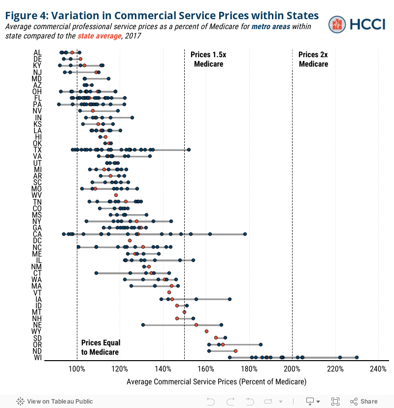
This variation in how commercial prices compare to Medicare across metro areas suggests that policies aimed at benchmarking commercial prices to Medicare rates may have substantially different impacts both across and within states. For example, consider if one of the proposed “public option” plans capped commercial prices at 150% of Medicare. As seen above, in a state like Louisiana, there might be little impact on changing professional service prices, as commercial payers in most metro areas within the state paid prices close to Medicare on average. However, in a state like Oregon, there might be a large impact because commercial insurers paid on average more than 150% of Medicare in most metro areas. In a state like Alabama, benchmarking commercial prices to Medicare may actually raise prices for professional services as providers negotiate commercial prices higher toward the 150% cap.
Finally, in places like California or Texas, there will be a disproportionate impact across different areas of the state because of wide variation in commercial prices relative to Medicare. For example, continuing with the example of a 150% of Medicare benchmark, on average professional service prices in a metro area like Bakersfield, CA – which were 94% of Medicare on average in 2017 – may be unaffected or could even see their prices raised to meet such benchmark. Alternatively, in metros like Santa Cruz, CA where average professional service prices were 178% of Medicare in 2017 may see substantial price decreases.
Discussion
Our findings and review of the literature suggest that the impact of policies benchmarking prices paid by commercial services to Medicare will affect providers across the U.S. health care system differently –across geographic areas and types of service categories (inpatient, outpatient, professional). Further, consistent with previous studies, we provide evidence that geographic differences will extend not only across metro areas, but also within them across different types of providers and even across different services among similar providers.
Given the disparity between them, policies that tie commercial prices more closely to Medicare rates, could create the opportunity to lower costs. Those possible cost savings also indicate the potential for concern and pushback among providers whose payments would be reduced Our findings clearly indicate that the impact of policies tying payment to Medicare rates would vary based on geography, specialty, and service. There also is the potential for a change in practice patterns that would result in some localities increasing or decreasing the utilization of certain services as the average reimbursement rate shifts the mix of higher and lower margin services. Market changes and pushback resulting from cost savings are likely to be greater in areas where commercial prices are particularly high relative to Medicare rates.
Limitations
Our analysis has several limitations that are important to consider when interpreting our findings. Our sample relies on data from three large national health insurers (Aetna, Humana, and United Healthcare). Although we do take steps to ensure HCCI has ample data in each reported geography, in some areas, the data from these contributors may capture a more representative sample of the commercial insurance market than others.
We compare commercial prices to Medicare rates by comparing what a given service in a given geographic area would have been reimbursed by Medicare using the Physician Fee Schedule. This comparison does not, however, account for all of the adjustments taken into account by Medicare when claims are actually paid. These consist of four broad categories: 1) across the board cuts to payments for all providers, namely sequestration, which is a 2% reduction in the PFS rate, 2) changes to PFS rates based on geography, namely the 10% Health Professional Shortage Area (HPSA) bonus payments made to areas with health care provider shortages in primary care, dental health or mental health, 3) provider-specific reductions or bonuses made to the PFS such as those being made based on provider performance with value based purchasing models, the electronic health record incentive program, or Method II CAH payments20 and 4) procedure-specific adjustments on the care delivered for certain procedures, including, for example, the 150% adjusted PFS payment for bilateral procedures or reductions to payments for certain care delivered in a CMS global period. Such adjustments could result in the prices paid by Medicare being higher or lower for certain types of services or in certain places. As a result, the comparison of commercial and Medicare rates may be biased by omitting adjustments to Medicare fees. To explore how this would affect our analysis we separately computed the ratio between average commercial payments for each service and average payments made by Medicare using a 100% sample of Medicare Fee-For-Service claims. We found that the measures computed using the two methods of measuring Medicare payments were broadly similar. For a more complete discussion see our methodology document.
While we provide a standardized comparison of prices across geographic areas, these findings do not directly speak to total spending by insurers or the revenue for providers. Importantly, there may be differences in utilization patterns that result in a different mix of services used in certain geographic areas. As a result, our findings may over or understate the true average price paid across the services geographic areas actually use.
Relatedly, there are important policy conversations happening about reimbursement for certain services (e.g. primary care) versus others that this analysis does not address.21 Specifically, this study does not address Medicaid reimbursement, which tends to be lower than the Medicare rates.22, 23 Any policy that benchmarks commercial prices to Medicare rates would also need to take into account a provider’s share of Medicaid patients to account for those substantially reduced rates.
Another concern is that our analysis may be biased by different utilization patterns between the commercial and Medicare populations. For example, Medicare beneficiaries may receive comparable services as commercially insured individuals but have them billed as different (more expensive) codes on average. In this case, our analysis (because we compare services based on identical codes) may overstate the true price difference for ostensibly the same service because they are billed using different (more expensive) codes in Medicare than in the commercial population.24 Another similar concern is that the comparison of the prices paid by commercial insurers to Medicare rates for a sample of services used by commercially insured individuals may not provide a representative picture of Medicare prices. For example, if Medicare beneficiaries used, on average, different services or the same services in different proportions comparing Medicare and commercial prices on our sample set of services may provide a misleading picture. However, we find that our sample services account for a comparable proportion of services used and total spending in both populations and the rates at which services were used in both populations were highly correlated. For a more complete discussion see our methodology document.
Note: This is an editorial update of a report previously released on June 30, 2020.
Endnotes
1 Cohrs, Rachel. “Healthcare Is Biggest Issue for Voters but Not for Congress.” Modern Healthcare, January 11, 2020. https://www.modernhealthcare.com/politics-policy/healthcare-biggest-issue-voters-not-congress.
2 Carroll, Linda. “1 in 3 Americans Worry about Being Able to Afford Health Care, NBC News/Commonwealth Fund Survey Says.” NBC News. Accessed June 24, 2020. https://www.nbcnews.com/health/health-news/1-3-americans-worry-about-being-able-afford-health-care-n1144426.
3Muñana, Cailey, Bryan Wu, and 2019. “Data Note: Americans’ Challenges with Health Care Costs.” KFF (blog), June 11, 2019. https://www.kff.org/health-costs/issue-brief/data-note-americans-challenges-health-care-costs/.
4 Cancryn, Adam. “POLITICO-Harvard Poll: Health Care Costs Are Top Priority Heading into Elections.” POLITICO. Accessed June 24, 2020. https://www.politico.com/news/2020/02/19/poll-health-care-election-115866.
5 through higher premiums and higher out-of-pocket costs (for services that are both in-network and out-of-network).
6 Sara, Collins, David Radley, and Jesse Baumgartner. “Trends in Employer Health Care Coverage, 2008–2018 | Commonwealth Fund.” Accessed June 24, 2020. https://doi.org/10.26099/btqx-ed95.
7 Sep 25, Published:, and 2019. “Benchmark Employer Survey Finds Average Family Premiums Now Top $20,000.” KFF (blog), September 25, 2019. https://www.kff.org/health-costs/press-release/benchmark-employer-survey-finds-average-family-premiums-now-top-20000/.
8 Health Care Cost Institute. “2018 Health Care Cost and Utilization Report.” (2020).
9 https://healthcostinstitute.org/hcci-originals/out-of-network-billing; https://www.vox.com/2019/4/24/18514240/california-surprise-er-bills-zuckerberg
10 https://www.npr.org/sections/health-shots/2019/03/20/704640661/health-plans-for-state-employees-use-medicares-hammer-on-hospital-bills
11 Ibid.
12 In a recent literature review, Kaiser Family Foundation found that a previous estimates of commercial prices relative to Medicare averaged 189% of Medicare rates for inpatient services, 264 % for outpatient services, and 143% for professional services across studies.
13 Baker LC, Bundorf MK, Royalty AB, Levin Z. Physician Practice Competition and Prices Paid by Private Insurers for Office Visits. JAMA. 2014;312(16):1653–1662. doi:10.1001/jama.2014.10921
14 We define services based on the combination of Common Procedure Terminology (CPT) code and CPT code modifier. We define a claim as the unique combination of individual, service dates, and service codes (CPT code, CPT modifier). We compute the average price paid as the sum of allowed amounts divided by a count of service sprovided.
15 The Medicare PFS pricing amounts are adjusted to reflect the variation in practice costs from area to area. A geographic practice cost index (GPCI) has been established for every Medicare payment locality for each of the three components of a procedure’s relative value unit (i.e., the RVUs for work, practice expense, and malpractice). The GPCIs are applied in the calculation of a fee schedule payment amount by multiplying the RVU for each component times the GPCI for that component. More information can be found here: https://www.cms.gov/Medicare/Medicare-Fee-for-Service-Payment/PhysicianFeeSched
16 Note that this amount does not take into account any adjustments to Medicare Physician Fee Schedule rates. To the extent that adjustments raise Medicare rates, we may overestimate the ratio of commercial to Medicare prices. For a more in depth discussion of this topic, see our methodology document.
17 Lopez, Eric, Gretchen Jacobson, and 2020. “How Much More Than Medicare Do Private Insurers Pay? A Review of the Literature.” KFF (blog), April 15, 2020. https://www.kff.org/medicare/issue-brief/how-much-more-than-medicare-do-private-insurers-pay-a-review-of-the-literature/.
18 Ginsburg, Paul. “Wide Variation in Hospital and Physician Payment Rates Evidence of Provider Market Power.” Health Systems Change. Accessed June 24, 2020. http://www.hschange.org/CONTENT/1162/#ib2.
19 Biener, Adam I., and Thomas M. Selden. “Public And Private Payments For Physician Office Visits.” Health Affairs 36, no. 12 (December 1, 2017): 2160–64. https://doi.org/10.1377/hlthaff.2017.0749.
20 Method II allows the Critical Access Hospital (CAH) to receive cost-based payment for facility services, plus 115% of fee schedule payment for professional services. The designation of a CAH is made generally by CMS using HRSA designations, is facility specific, and is intended for rural facilities.
21 Reiff, Julie, Niall Brennan, and Jean Fuglesten Biniek. “Primary Care Spending in the Commercially Insured Population.” JAMA 322, no. 22 (December 10, 2019): 2244–45. https://doi.org/10.1001/jama.2019.16058.
22 KFF. “Medicaid-to-Medicare Fee Index,” July 12, 2017. https://www.kff.org/medicaid/state-indicator/medicaid-to-medicare-fee-index/.
23 Medicare Payment Advisory Commission. “Report to the Congress: March 2019.” (2019).
23 Geruso, Michael, and Timothy Layton. “Upcoding: Evidence from Medicare on Squishy Risk Adjustment.” Journal of Political Economy 128, no. 3 (March 1, 2020): 984–1026. https://doi.org/10.1086/704756.